
TabBar介绍
一个显示水平行选项卡的Widget。 通常创建为 AppBar 的 AppBar.bottom 部分并与 TabBarView 结合使用
在什么情况下使用TabBar
当你的app内容类别比较多的时候,我们常常会用到TabBar,例如网易新闻、京东、B站等,所以TabBar是一个使用非常频繁的组件。
示例代码
本文中很多效果都没有截图,可下载源代码运行项目 源代码地址,或者通过视频教程查看 视频教程地址
如何使用
步骤一:创建TabController
为了使所选的 tab 与它所对应的内容能够同步变化,需要用 TabController 进行控制。我们既可以手动创建一个 TabController ,也能够直接使用 DefaultTabController widget。最简单的选择是使用 DefaultTabController widget,因为它能够创建出一个可供所有子 widgets 使用的 TabController。
1
2
3
4
5
DefaultTabController(
  // 选项卡的数量
  length: 3,
  child: // 在下一步完成此代码
);
步骤二:创建tabs
当我们创建DefaultTabController, 接下来就可以用 TabBar widget 来创建 tabs。下面这个创建了包含三组 Tab widget 的 TabBar(一个),并把它放置于 AppBar widget 中。
1
2
3
4
5
6
7
8
9
10
11
12
13
14
15
DefaultTabController(
  length: 3,
  child: Scaffold(
    appBar: AppBar(
      title: Text("TabBar"),
      bottom: TabBar(
        tabs: [
          Tab(icon: Icon(Icons.directions_bike),),
          Tab(icon: Icon(Icons.directions_boat),),
          Tab(icon: Icon(Icons.directions_car),),
        ],
      ),
    ),
  ),
);
TabBar 默认将会在 Widget 树中向上寻找离它最近的一个 DefaultTabController 节点作为自己的 TabController。如果您想手动创建 TabController,那么您必须将它作为参数传给 TabBar。
步骤三:为每个Tab创建内容
现在我们已经成功创建了一些 tabs,接下来要实现的是 tab 被选中时显示其对应的内容。为了实现这个效果,我们将使用 TabBarView widget。
1
2
3
4
5
6
7
8
9
10
11
12
13
14
15
16
17
18
19
20
21
22
23
24
25
26
27
28
29
30
31
32
33
34
import 'package:flutter/material.dart';

class TabBarExample extends StatefulWidget {
  @override
  _TabBarExampleState createState() => _TabBarExampleState();
}

class _TabBarExampleState extends State<TabBarExample> {
  @override
  Widget build(BuildContext context) {
    return DefaultTabController(
      length: 3,
      child: Scaffold(
        appBar: AppBar(
          title: Text("TabBar"),
          bottom: TabBar(
            tabs: [
              Tab(icon: Icon(Icons.directions_bike),),
              Tab(icon: Icon(Icons.directions_boat),),
              Tab(icon: Icon(Icons.directions_car),),
            ],
          ),
        ),
        body: TabBarView(
          children: [
            Icon(Icons.directions_bike),
            Icon(Icons.directions_boat),
            Icon(Icons.directions_car),
          ],
        ),
      ),
    );
  }
}
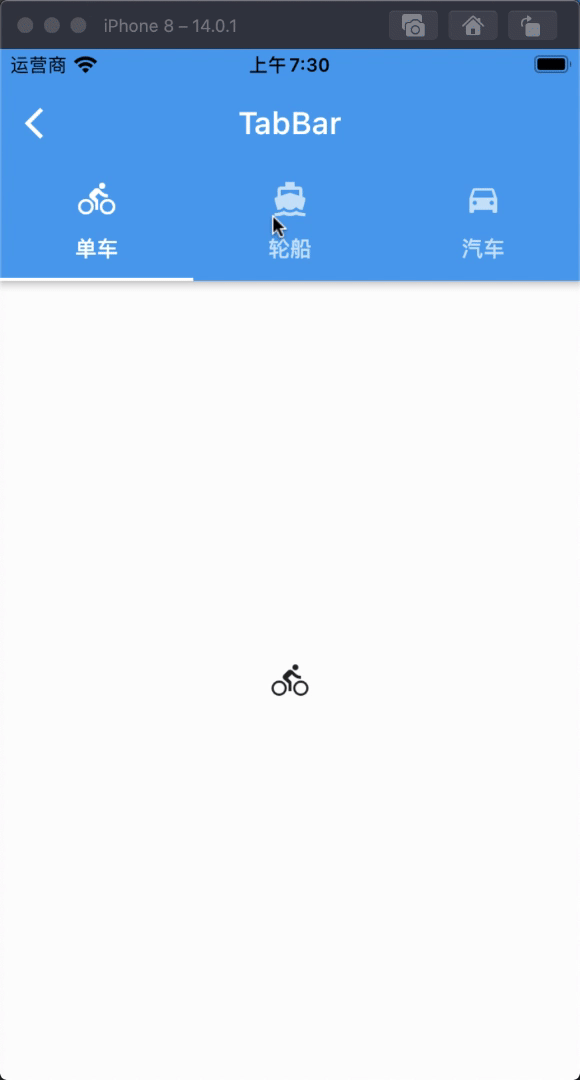
从上面这个小例子中我们简单的体验了一下 TabBar 是怎么结合 TabBarView 来使用的。
DEMO效果
TabBar属性和说明
总共20个属性
| 字段 | 属性 | 描述 |
|---|---|---|
| tabs | List |
两个多个的Tab列表 |
| controller | TabController | 控制tab的控制器 |
| isScrollable | bool | 标签栏是否可以水平滚动 |
| indicatorColor | Color | 设置选中Tab指示器的颜色 |
| automaticIndicatorColorAdjustment | bool | 是否自动调整indicatorColor |
| indicatorWeight | double | 设置选中Tab指示器线条的粗细 |
| indicatorPadding | EdgeInsetsGeometry | 设置选中Tab指示器间距,默认值为 EdgeInsets.zero |
| indicator | Decoration | 设置选中Tab指示器的外观 |
| indicatorSize | TabBarIndicatorSize | 设置选中Tab指示器的大小 |
| labelColor | Color | 设置选中Tab文字的颜色 |
| labelStyle | TextStyle | 设置选中Tab文字的样式 |
| labelPadding | EdgeInsetsGeometry | 设置选中Tab文字的间距 |
| unselectedLabelColor | Color | 设置未选中Tab文字的颜色 |
| unselectedLabelStyle | TextStyle | 设置未选中Tab文字的样式 |
| dragStartBehavior | DragStartBehavior | 处理拖动开始行为的方式 |
| overlayColor | MaterialStateProperty |
定义响应焦点、悬停和飞溅颜色 |
| mouseCursor | MouseCursor | 鼠标指针进入或悬停在鼠标指针上时的光标 |
| enableFeedback | bool | 检测到的手势是否应提供声音和/或触觉反馈 |
| onTap | ValueChanged |
单击Tab时的回调 |
| physics | ScrollPhysics | TabBar的滚动视图如何响应用户输入 |
TabBar属性详细使用
1、tabs
由两个多个组成的Tab列表
使用方法
1
2
3
4
5
6
7
TabBar(
  tabs: [
    Tab(icon: Icon(Icons.directions_bike),),
    Tab(icon: Icon(Icons.directions_boat),),
    Tab(icon: Icon(Icons.directions_car),),
  ],
)
2、controller
可以控制tab的控制器
使用方法
1
2
3
4
5
6
7
8
9
10
11
12
13
14
15
16
17
18
TabController _tabController;

@override
void initState() {
  // TODO: implement initState
  super.initState();
  _tabController = TabController(length: 3, vsync: this);
}

TabBar(
  controller: _tabController,
  tabs: [
    Tab(icon: Icon(Icons.directions_bike),),
    Tab(icon: Icon(Icons.directions_boat),),
    Tab(icon: Icon(Icons.directions_car),),
  ],
)
3、isScrollable
标签栏是否可以水平滚动
使用方法
1
2
3
4
5
6
7
8
TabBar(
  isScrollable: false,
  tabs: [
    Tab(icon: Icon(Icons.directions_bike),),
    Tab(icon: Icon(Icons.directions_boat),),
    Tab(icon: Icon(Icons.directions_car),),
  ],
)
4、indicatorColor
设置选中Tab指示器的颜色
使用方法
1
2
3
4
5
6
7
8
TabBar(
  indicatorColor: Colors.red,
  tabs: [
    Tab(icon: Icon(Icons.directions_bike),),
    Tab(icon: Icon(Icons.directions_boat),),
    Tab(icon: Icon(Icons.directions_car),),
  ],
)
5、automaticIndicatorColorAdjustment
是否自动调整 indicatorColor,如果 automaticIndicatorColorAdjustment 为 true 时,那么indicatorColor 会自动调整成 Colors.white
使用方法
1
2
3
4
5
6
7
8
TabBar(
  automaticIndicatorColorAdjustment: false,
  tabs: [
    Tab(icon: Icon(Icons.directions_bike),),
    Tab(icon: Icon(Icons.directions_boat),),
    Tab(icon: Icon(Icons.directions_car),),
  ],
)
6、indicatorWeight
设置选中Tab指示器线条的粗细
使用方法
1
2
3
4
5
6
7
8
9
TabBar(
  indicatorColor: Colors.red,
  indicatorWeight: 5,
  tabs: [
    Tab(icon: Icon(Icons.directions_bike),),
    Tab(icon: Icon(Icons.directions_boat),),
    Tab(icon: Icon(Icons.directions_car),),
  ],
)
7、indicatorPadding
设置选中Tab指示器间距,默认值为 EdgeInsets.zero
使用方法
1
2
3
4
5
6
7
8
9
10
TabBar(
  indicatorColor: Colors.red,
  indicatorWeight: 5,
  indicatorPadding: EdgeInsets.only(bottom: 2),
  tabs: [
    Tab(icon: Icon(Icons.directions_bike),),
    Tab(icon: Icon(Icons.directions_boat),),
    Tab(icon: Icon(Icons.directions_car),),
  ],
)
8、indicator
设置选中Tab指示器的外观
使用方法
1
2
3
4
5
6
7
8
9
10
11
12
13
14
15
16
TabBar(
  indicatorColor: Colors.red,
  indicatorWeight: 5,
  indicatorPadding: EdgeInsets.only(bottom: 2),
  indicator: BoxDecoration(
    gradient: LinearGradient(colors: [
      Colors.orange,
      Colors.green
    ]),
  ),
  tabs: [
    Tab(icon: Icon(Icons.directions_bike),),
    Tab(icon: Icon(Icons.directions_boat),),
    Tab(icon: Icon(Icons.directions_car),),
  ],
)
9、indicatorSize
设置选中Tab指示器的大小,该值是一个枚举类型,TabBarIndicatorSize.tab 跟随 Tab 的宽度,TabBarIndicatorSize.label 跟随 Tab 内容文字的宽度。
使用方法
1
2
3
4
5
6
7
8
9
TabBar(
  indicatorColor: Colors.red,
  indicatorSize: TabBarIndicatorSize.tab,
  tabs: [
    Tab(icon: Icon(Icons.directions_bike),),
    Tab(icon: Icon(Icons.directions_boat),),
    Tab(icon: Icon(Icons.directions_car),),
  ],
)
10、labelColor
设置选中Tab文字的颜色
使用方法
1
2
3
4
5
6
7
8
9
TabBar(
  indicatorColor: Colors.red,
  labelColor: Colors.pink,
  tabs: [
    Tab(icon: Icon(Icons.directions_bike),),
    Tab(icon: Icon(Icons.directions_boat),),
    Tab(icon: Icon(Icons.directions_car),),
  ],
)
11、labelStyle
设置选中Tab文字的样式
使用方法
1
2
3
4
5
6
7
8
9
10
11
TabBar(
  labelStyle: TextStyle(
    backgroundColor: Colors.green,
    fontSize: 20
  ),
  tabs: [
    Tab(icon: Icon(Icons.directions_bike), text: "单车",),
    Tab(icon: Icon(Icons.directions_boat), text: "轮船",),
    Tab(icon: Icon(Icons.directions_car), text: "汽车",),
  ],
)
12、labelPadding
设置选中Tab内容的间距
使用方法
1
2
3
4
5
6
7
8
9
10
11
12
TabBar(
  labelStyle: TextStyle(
    backgroundColor: Colors.green,
    fontSize: 20
  ),
  labelPadding: EdgeInsets.all(0),
  tabs: [
    Tab(icon: Icon(Icons.directions_bike), text: "单车",),
    Tab(icon: Icon(Icons.directions_boat), text: "轮船",),
    Tab(icon: Icon(Icons.directions_car), text: "汽车",),
  ],
)
13、unselectedLabelColor
设置未选中Tab文字的颜色
使用方法
1
2
3
4
5
6
7
8
TabBar(
	unselectedLabelColor: Colors.orange,
  tabs: [
    Tab(icon: Icon(Icons.directions_bike), text: "单车",),
    Tab(icon: Icon(Icons.directions_boat), text: "轮船",),
    Tab(icon: Icon(Icons.directions_car), text: "汽车",),
  ],
)
14、unselectedLabelStyle
设置未选中Tab文字的样式
使用方法
1
2
3
4
5
6
7
8
9
10
11
TabBar(
	unselectedLabelColor: Colors.orange,
  unselectedLabelStyle: TextStyle(
    backgroundColor: Colors.pink
  ),
  tabs: [
    Tab(icon: Icon(Icons.directions_bike), text: "单车",),
    Tab(icon: Icon(Icons.directions_boat), text: "轮船",),
    Tab(icon: Icon(Icons.directions_car), text: "汽车",),
  ],
)
15、dragStartBehavior
处理拖动开始行为的方式
使用方法
1
2
3
4
5
6
7
8
9
10
11
12
TabBar(
	unselectedLabelColor: Colors.orange,
  unselectedLabelStyle: TextStyle(
    backgroundColor: Colors.pink
  ),
  dragStartBehavior: DragStartBehavior.start,
  tabs: [
    Tab(icon: Icon(Icons.directions_bike), text: "单车",),
    Tab(icon: Icon(Icons.directions_boat), text: "轮船",),
    Tab(icon: Icon(Icons.directions_car), text: "汽车",),
  ],
)
16、overlayColor
定义响应焦点、悬停和飞溅颜色。
如果非空,则会使用 MaterialState.focused, MaterialState.hovered, and MaterialState.pressed 之一进行解析。
17、mouseCursor
鼠标指针进入或悬停在鼠标指针上时的光标,针对 Flutter web 应用。
使用方法
1
2
3
4
5
6
7
8
9
10
11
12
TabBar(
	unselectedLabelColor: Colors.orange,
  unselectedLabelStyle: TextStyle(
    backgroundColor: Colors.pink
  ),
  mouseCursor: SystemMouseCursors.allScroll,
  tabs: [
    Tab(icon: Icon(Icons.directions_bike), text: "单车",),
    Tab(icon: Icon(Icons.directions_boat), text: "轮船",),
    Tab(icon: Icon(Icons.directions_car), text: "汽车",),
  ],
)
18、enableFeedback
检测到的手势是否应提供声音和/或触觉反馈,默认为 true
使用方法
1
2
3
4
5
6
7
8
TabBar(
  enableFeedback: true,
  tabs: [
    Tab(icon: Icon(Icons.directions_bike), text: "单车",),
    Tab(icon: Icon(Icons.directions_boat), text: "轮船",),
    Tab(icon: Icon(Icons.directions_car), text: "汽车",),
  ],
)
19、onTap
单击Tab时的回调
使用方法
1
2
3
4
5
6
7
8
9
10
11
TabBar(
  enableFeedback: true,
  onTap: (index) {
    print(index);
  },
  tabs: [
    Tab(icon: Icon(Icons.directions_bike), text: "单车",),
    Tab(icon: Icon(Icons.directions_boat), text: "轮船",),
    Tab(icon: Icon(Icons.directions_car), text: "汽车",),
  ],
)
20、physics
TabBar的滚动视图如何响应用户输入,
例如,确定在用户停止拖动滚动视图后滚动视图如何继续动画。
使用方法
1
2
3
4
5
6
7
8
TabBar(
  physics: NeverScrollableScrollPhysics(),
  tabs: [
    Tab(icon: Icon(Icons.directions_bike), text: "单车",),
    Tab(icon: Icon(Icons.directions_boat), text: "轮船",),
    Tab(icon: Icon(Icons.directions_car), text: "汽车",),
  ],
)
总结
以上是 TabBar 的属性详细解析并写了一个简单的 demo ,在平时的开发过程中 TabBar
组件用的还是相对比较频繁的,也是开发人员必须掌握的一个组件。